What is Correlated Colour Temperature (CCT)
A quiet shift often takes place inside commercial spaces once the right colour temperature is chosen. Warmer tones are more calming and will soften the daily routine, while cool tones increase attention. Across Warehouses and Industrial Facilities, these choices tend to shape how spaces feel, function, and stay safe. A growing variety of lighting products in Canada continues to make this decision easier, though many spaces still rely on basic assumptions about light.
Guide to Choosing the Right Correlated Colour Temperature (CCT) for Commercial Space
The following guide brings clarity to colour temperature, offering a simple and human look at how light shapes work environments.
How does colour temperature guide the atmosphere of a commercial space?
A strange thing happens the moment colour temperature is noticed. It often feels like a familiar memory, something tied to evenings near warm light sources or mornings spent beneath crisp white light. Many commercial spaces, including warehouses and industrial facilities, often neglect this effect. Yet the colour of light, blue or yellow, cold or warm, soft or sharp, shapes the daily mood of any area.
The commercial environment is often similar to a home. To finish their tasks, people walk through the aisles and across the concrete floor. These movements are surrounded by light. The light surrounding those movements has a warm colour temperature.
Large facilities tend to depend heavily on artificial illumination, often from lighting products in Canada designed to support long operating hours. Those products carry different ratings that reveal how the light may appear once installed. The choices you make can affect security, workflow and safety of your employees, in addition to the overall comfort of your guests.
What is Correlated Colour Temperature (CCT)?
In Warehouses and Industrial Facilities, including other work settings, the lighting is simply a glow overhead.However, every bulb shows its own personality, shaped by the temperature or warmth of the light it gives off. This feature is known as Correlated Colour Temperature (CCT), a Kelvin-based metric that reveals whether lighting appears warmer or cooler. The majority of lighting products in Canada have this scale in clear print, providing clear information for people who want to choose lighting fixtures.
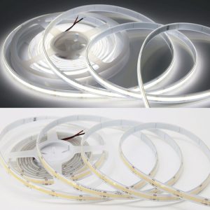
The warm hue typically resembles warm amber light from sources like incandescent lamps or the soft lighting of a flame. The tones that are used for this sit at the bottom of the Kelvin scale. The light feels calm, familiar, and slightly nostalgic.
Warehouses sometimes use these tones in break areas or spaces meant for slower, quieter activities. A light colour in the red or yellow spectrum is a good way to soften surroundings and create a feeling of calm.
Higher Kelvin values, on the other hand, are a sign of cooler temperatures. Tones that are higher in Kelvin provide a sharper and more refined kind of clarity. This type of light is often chosen in areas needing precision or alertness. A cool colour temperature leans blue, producing a form of illumination that resembles daylight or bright white light. In busy industrial settings, cooler tones may help tasks stay clear and focused.
CCT matters because it sets clear expectations for how the light will look even before the fixture is installed. The number on the box tells you exactly how the light may appear once it spreads across your space. Whether the glow should feel like the light of a fire or something closer to crisp daylight, the CCT rating sets that tone. Choosing colour temperature becomes easier once this scale is understood.
Difference Between CCT And CRI
A short introduction helps set the stage. Colour temperature and accuracy frequently get confused, even though they refer to two distinct qualities. CCT (Correlated Colour Temperature) describes how warm or cool light is. CRI (Colour Rendering Index) explains how precisely colours can be seen in that light. Numerous Warehouses and Industrial Facilities depend on both aspects, but each affects a particular space in a different way.
What does CCT describe?
CCT explains how warm or cool light appears once a light source emits it. The warmer light may be similar to the tone created by the incandescent bulb or the warm glow of a flame. Cooler glows tend to produce a clear, pure white light. This measurement uses Kelvin to help you anticipate whether the installed light will lean yellow or blue.
What does CRI describe?
CRI serves as an index that shows how accurately a light source reveals colours. Higher CRI values let objects, surfaces, and even materials look natural without washed-out or discoloured tones that can happen under low lighting. Numerous Warehouses and Industrial Facilities depend on CRI for colour accuracy when it is a factor in safety, labelling, or inspections.
How do CCT and CRI affect Visual Comfort?
CCT creates the emotion of warmth or coolness of an area, while CRI determines the quality of the colours within it. A cooler temperature can enhance visibility, but CRI ratings that are low may make colours appear dull. Warm temperatures can bring a calmer environment; however, tasks that require precise colour judgment could be affected if CRI ratings are low.
How are CCT and CRI chosen for different tasks?
CCT selections usually follow the desired atmosphere of the environment. Cooler tones may be placed in spaces needing focus, while warmer tones may fit areas intended for rest. CRI selections follow the need for colour accuracy. Areas involving sorting, inspection, or safety markings often require higher CRI ratings. Warehouses and Industrial Facilities often blend both factors to keep each task properly supported.
Why do both measurements matter in commercial spaces?
CCT influences the emotional and functional feel of a space, while CRI influences how accurately the human eye interprets details within that space. Together, these measurements shape safety, comfort, and clarity across environments where lighting plays a central role. Balanced choices tend to create surroundings that feel natural, comfortable, and visually reliable.
Choosing Colour Temperature By Application in Your Commercial Space
A brief introduction helps tie the idea together. Every corner of a commercial space carries its own purpose. The colour temperature that is effective for one location will not work in an entirely different one. Safety, comfort, and clarity depend on the manner in which light is presented. Over Warehouses and Industrial Facilities, different zones generally require distinct lighting hues to aid in the daily activities.
- Warm tones for rest areas
Warmer colour temperatures help break areas feel peaceful. Light resembling the glow of a fire tends to relax the eyes. Areas meant for short pauses or lunches benefit from this softness.
- Neutral tones for general work zones
Mid-range tones create balance. The light appears neither strongly yellow nor blue, offering steady visibility. Spaces with mixed tasks often rely on this balanced form of white light.
- Cooler tones for precision tasks
Cooler colour temperatures improve clarity and detail. An energetic, clean atmosphere forms naturally cool white light. Warehouses and Industrial Facilities often use this in high-activity zones.
- Warmer tones for customer-facing spaces
Some commercial spaces use warm light sources for a welcoming effect. Soft yellow tones make displays appear comfortable and inviting. A gentle glow helps visitors feel at ease.
- Cool white for storage and high shelves
Tall racks and inventory aisles benefit from crisp illumination. Cool white helps shadows appear reduced, allowing safer navigation. Large facilities often prioritize visibility in these zones.
How Does Lighting Shape Comfort Inside Industrial and Commercial Environments?
Comfort often begins with small details, and light usually leads that list. A warehouse floor may stretch out across hundreds of feet, filled with machines, equipment, and storage. Each corner behaves differently once the lighting shifts. Many Warehouses and Industrial Facilities rely on consistent illumination to support long hours of movement and focus. The temperature of that light influences energy, ease, and awareness.
Canada’s wide selection of lighting products lets you shape every space with clear intention. Some fixtures cast warm tones that mirror older incandescent sources. Others deliver bright, cooler light that stays steady during demanding conditions. The right balance sets the emotional and visual tone of the space. Light guides the way people work, walk, and communicate, shaping comfort in subtle yet powerful ways.
Closing thought
Colour temperature holds a quiet influence over every commercial space. All across Warehouses and Industrial Facilities, every shift in temperature or coolness alters the atmosphere, clarity and the comfort of people travelling through the space. There are a variety of options, from warm lighting that echoes the warm glow of a fire to cool white that sharpens the senses and shows the details.
Faraday’s wide range of lighting products lets you choose thoughtfully, guided by an understanding of how light works. The right tone becomes more than brightness, becoming part of the story, a space that tells each day.
FAQs:
What is CCT?
CCT describes how warm or cool the light appears. It guides whether the glow feels yellow, blue, soft, or crisp in a commercial space.
Why does CRI matter?
CRI shows how true colours look under a light source. Clearer colour accuracy helps tasks feel safer and easier in busy work areas.
What is the difference between CCT and CRI?
CCT affects the warmth or coolness of light. CRI affects how colours appear. Both shape comfort and clarity in commercial spaces.
Which CCT fits work areas?
Cooler temperatures usually support alertness and clear visibility in active zones, especially inside warehouses and industrial facilities.
Do warmer lights help comfort?
The warmer tones make for softer and peaceful environments. They feel familiar and reminiscent of traditional incandescent or firelight bulbs.
Recent Posts
What Does DLC Certification Mean & Why Does It Matter?
If you have ever shopped for commercial LED fixtures in Canada and noticed a small…
Understanding Types of Light Bulbs, Sizes, Shapes, and Codes
Experienced lighting technicians emphasize that bulbs function as precision instruments rather than simple illumination devices.…
10 Reasons Businesses Are Switching to Motion-Activated Lighting
For Canadian business owners, property managers, and facility operators, the quest for efficiency isn't just…
LED vs Halogen Light Bulbs
Choosing the right light bulbs for your home of offices might seem like a simple…
14 Lighting Audit Questions Every Facility Manager Should Ask
How to prepare, analyze, claim rebates, and maximize ROI from lighting investments. A lighting audit…
Why Your Warehouse Lighting is Costing You 40% More Than It Should (And How to Fix It)
Is your current warehouse lighting costing you more in overhead than it should, silently draining…
